

The first rule of thumb when it comes to creating a responsive web design is making sure that there is a ’mobile view’ or ‘mobile version’ available for your website, especially if you own an eCommerce website.
The second thing is to make sure that your eCommerce website is literally as we speak, responsive. Meaning easy to use, compatible, and designed according to the preference of your target customers’ age group.
But what are other ways we can increase your website’s visitors’ traffic? Continue reading to find out.
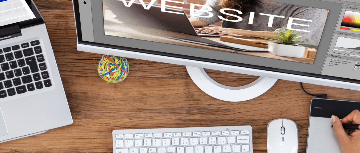
What is Responsive Web Design?
It means that your website design has to be compatible in terms of design and resolution on all types of devices such as desktops, tablets, and smartphones.
To get started, the theme during website design shouldn’t be too narrowed down, or too diversified- i.e flexible.
Another thing is when your use shifts their 2-in-1 laptops from desktop to tablet view, your website design should be as such that it automatically switches modes according to image size and resolution.
You should also make sure that your eCommerce website isn’t blocked out by users using either iPhones or androids. Meaning that the website design should be as such that it automatically responds to user preference and layout settings.
Tools and Techniques for Responsive Web Design
CSS Transitions and Media Queries
Here you will use media queries to design your eCommerce website in such a way that it automatically adapts to the layout of a browser be it on a desktop or tablet. You can also use animations to make the process less confusing for the user.
Responsive Data Tables
Avoid using conventional tables where users have trouble zooming in and out for the text. Adopt methods such as better readability, converting to graphs and charts, and automatic resizing to narrow or wide tables when the browser width is changed.
Using Dropdown Menus
It becomes very difficult to navigate menu categories on small screens. This is why adopting a dropdown menu will make the experience much easier. Also resizing the text to the same size rather than smaller text which the user has to zoom in or out for.
Limitations of Responsive Web Design
Image Resolution
Image resolution is highly affected by the newly introduced high-density screens. Apple’s retina devices and Google’s XHDPI face challenges in maintaining the expected image resolution on certain websites. Website builders retreat to double-sized images but that just causes the page to load much slower.
Responsive Layout
Even with today’s advanced techniques and methods, the layout of website content may not appear for a mobile view as it does for desktops. This problem often arises when using CMS.
Other Complex Content Layout
This includes forms and tables which may require users to insert data. In which case you will need to take some time thinking out the appropriate design for it.
We hope this information provided you with a brief overview of what you will and should expect when designing your eCommerce website. All it takes is the appropriate approach and method to ace it.